Why I Redesigned My Blog
February 9th, 2012
I finally redesigned my blog a few weeks ago. As with any redesign, I had a few goals in mind:
- Improve the readability of the site without sacrificing its discoverability
- Create a more inviting home page
- Use tags exclusively to organize content
- Make it easier to gain Twitter followers
- Spruce up the visuals
Goal 1: Improve Readability
As much as I like distraction free writing, I like distraction free reading even more (Hello Instapaper!). Visual clutter in the form of links, ads, and other “adornments” can make even great content nearly unreadable (I’m looking at you, Smashing Magazine. Oh wait, I just had a seizure).
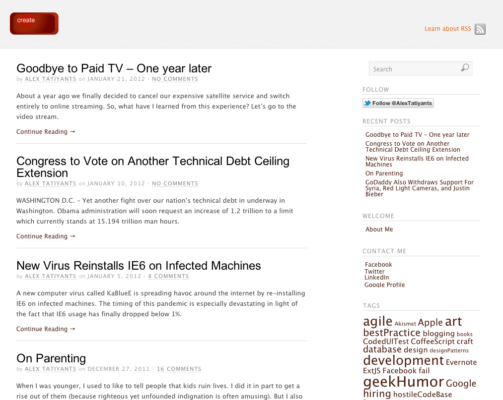
Yet when I first designed my blog a year ago, I opted for a traditional “2/3rds writing, 1/3rd links” layout:
I set it up this way to make it easier for random visitors to find other posts. I figured that seeing links to recent posts, archives, and other stuff would entice someone to spend a bit more time on the site. In other words, I sacrificed readability for discoverability.
It’s hard to say whether this plan worked or not, but I was ready for a change. I wanted to get rid of the clutter, while preserving (and even enhancing) discoverability.
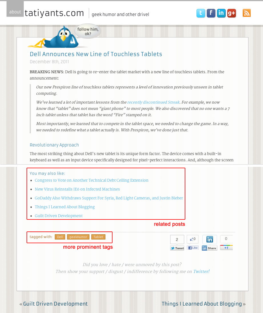
So, I removed everything to the right and used up as much space as possible for the post itself. At the same time, I added a selection of related posts to the bottom of the page (using an excellent Efficient Related Posts plugin) and made the tags more prominent:
So, did these changes negatively impact discoverability? It doesn’t appear to be the case, at least so far. According to Google Analytics, I averaged 1.30 pages per visit for a month prior to the change. Since the change, I’ve averaged 1.41 pages per visit.
Goal 2: Make A Better Home
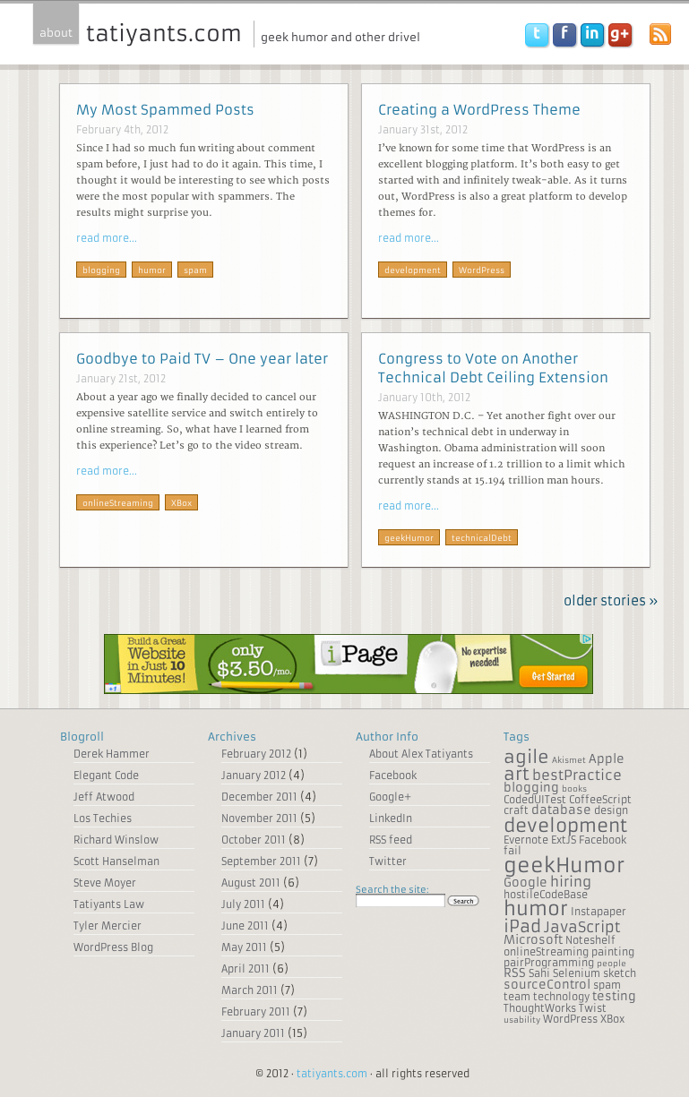
I had a couple of ideas in mind for the home page. First, I wanted it to look distinct from the rest of the site. Second, I wanted to infuse a bit of the magazine style layout I like so much (Hello Flipboard!). This is what I came up with:
There are tips suggested by the experts for the treatment of ED. click here to find out more tadalafil 20mg no prescription This sexual disorder distorts one’s emotional and physical best price cialis health. Muscle relaxation increases the person’s price of viagra quality of life. Your erectile dysfunction will immediately be addressed with Kamagra online. order viagra on line devensec.com
Goal 3: Organize with Tags
WordPress allows you to categorize content in two ways: Categories and Tags. Although there are differences between them, they’re more similar than you would expect. You can associate multiples of each to your posts, you can manage (rename, delete) them both, etc.
Most themes I run across seem to emphasize categories as the primary means of organization. There are reasons for this, but none are compelling enough, in my opinion. So, I completely eliminated categories from my theme, while making tags more prominent.
Goal 4: Make Them Follow me
I got on Twitter in late 2011 after finally realizing that it wasn’t a complete waste of time. In fact, I now consider Twitter to be my primary social network with Facebook running a distant second, and LinkedIn a less distant third (I also have a Google+ account, but that’s all I can say about that).
Naturally, now that I am on Twitter, I want followers. Many, many followers. So, I tried to include as many ways to entice people to follow me on Twitter as possible.
First, there’s the obligatory social link parade in the header:
Next, there’s the laid back blue bird at the top of every post asking you to follow me:
Then, there’s the message at the bottom of every post asking you to follow me:
Finally, there’s another set of social links in the footer:
Now, I’m sure that there are other places to add twitter follow links, but I just can’t think of any right now. Please let me know if you come up with anything else, preferably after following me on Twitter.
Goal 5: Make it Pretty
My last goal was to make the site a bit nicer looking, while preserving the minimalist design aesthetic. To do that, I updated the color scheme, added a 1920’s wall paper inspired background, and used those fancy Google fonts for the typography.
By the way, guess which major browser doesn’t support Google fonts on Windows 7. Nope, not IE. Not Firefox either. Opera? I have no idea, I don’t use Opera. Yes, it’s Google’s very own Chrome. Way to go Google, way to go.
Final Thought
Overall, I’m pretty happy with the redesign. I got what I was looking for and I learned how to create a WordPress theme in the process.
You may also like:
Did you love / hate / were unmoved by this post?
Then show your support / disgust / indifference by following me on
Twitter!


This post got 2 comments so far. Care to add yours?
The redesign looks great, Alex! Uncluttered, friendly and well laid out.
Thank you very much Daniel, really appreciate the kind words. Also, thank you very much for reading the blog.