
Jenkins Build Monitor
We use and really like Jenkins for our Continuous Integration. It’s been around forever and has lots of capabilities as a result. Yet in spite of its maturity, Jenkins lacks a really great build monitor (either built-in or as a plugin).
So, during a recent Hackathon, a few of us decided to make a new build monitor for Jenkins. We wanted it to be informative, big-screen friendly, and beautiful (yes, beautiful). Here’s what we ended up making:
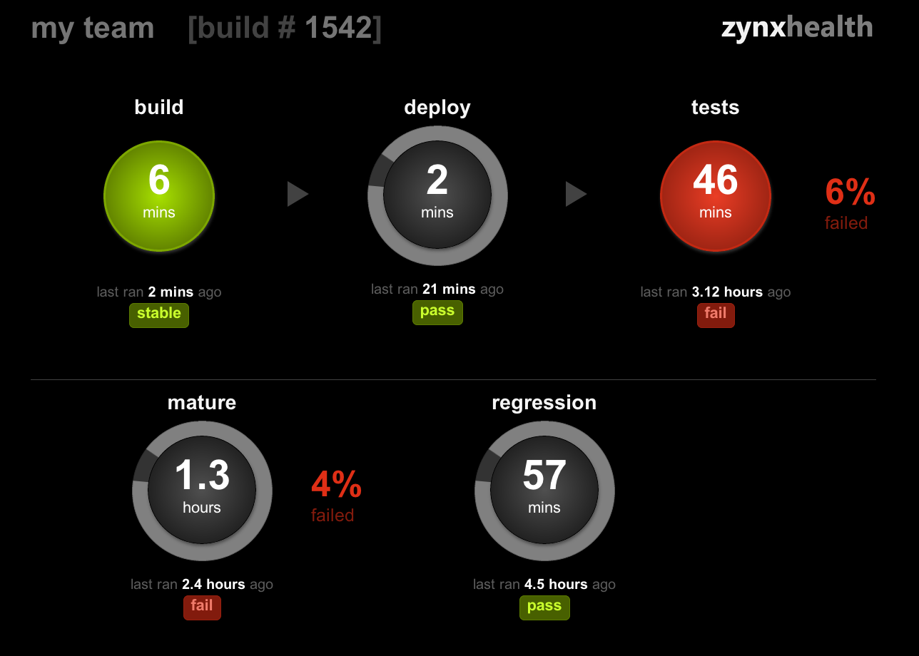
We call it Z-mon. It’s distributed as a Jenkins plugin and you can find the code for it on gitHub.
Making a Build Monitor
The Challenge: TMI (Too Much Information)
Build monitors present an interesting UX challenge. Like with most glance-able interfaces, the tough part with build monitors isn’t what to show, it’s what to omit. This is due to the fact that CI pipelines can get quite complex:
- Multiple roles: different jobs have different purposes (builds, deploys, tests, etc)
- Dependencies: jobs typically depend on other jobs and they may run sequentially or in parallel
- Sheer volume: it’s not unusual for a CI system to manage tens if not hundreds of jobs
Though it’s tempting to cram all of this information into a build monitor, that strategy is unlikely to yield positive results. Fire-hosing people with data will probably not help them quickly decide whether an action is required. By the way, probably the most common action that arises from checking the build monitor is visiting Jenkins for more information, which is perfectly fine.
It’s also important to realize that build monitors can serve different audiences (devs, release management, devOps, etc.). Each group may be looking for different types of information, so it’s probably unrealistic to create a single build monitor which would work for all.
The Solution: Simplify, Simplify, Simplify
So, how did we distill all of this CI data into an easily digestible, big monitor compliant visualization? We focused on helping developers answer three key questions:
- How is the health of the current work stream (i.e. the iteration I’m currently working on)?
- How is the health of next release (across multiple teams)?
- How is the health of overall code base?
To do that, we organized the information displayed on a screen into three different areas:
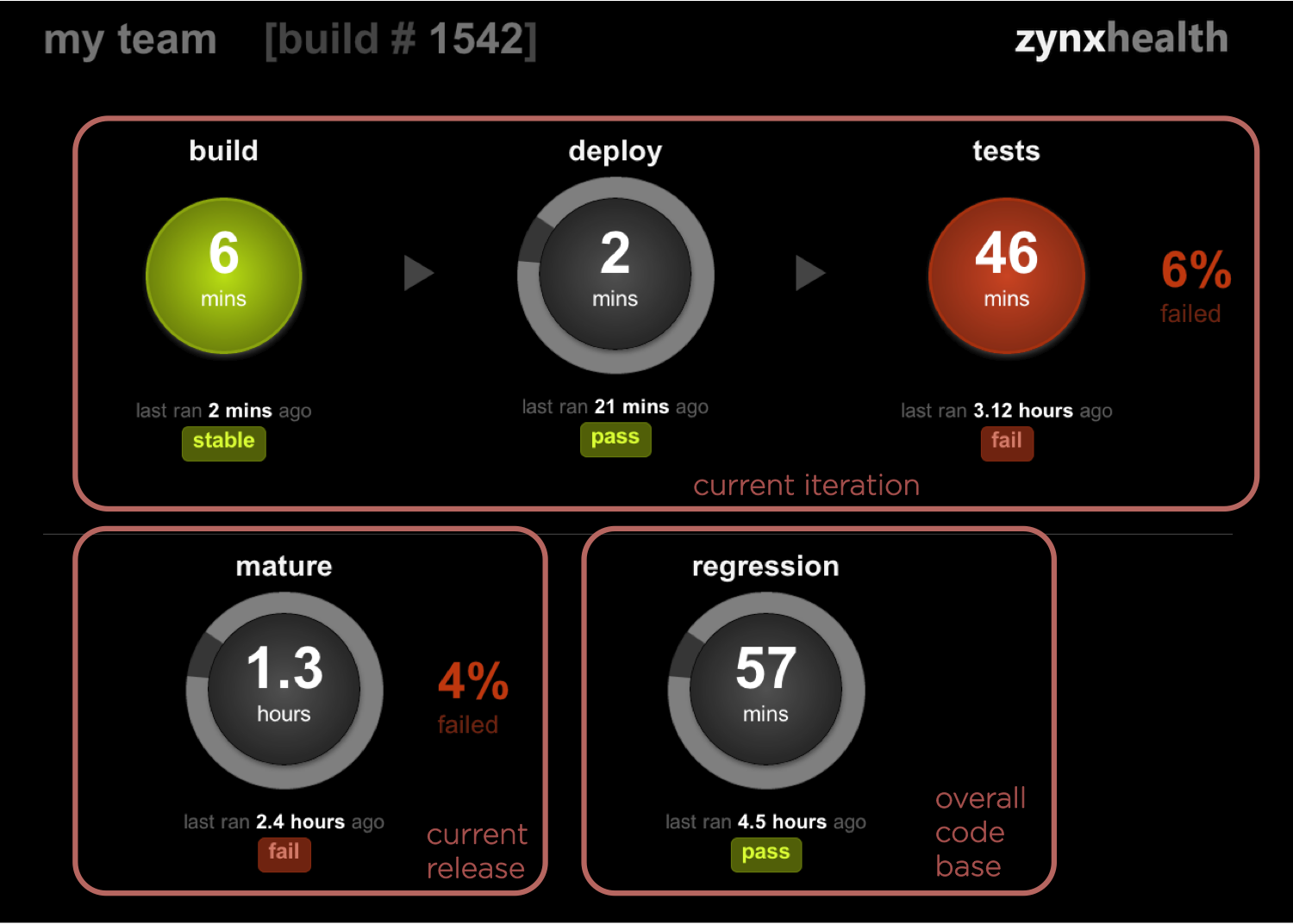
At the top, we display a simplified version of the current iteration pipeline. It includes just three jobs: build, deploy, and tests. On the bottom left corner, we display a single job representing the current release. Finally, the bottom right corner shows a single job representing the health of the overall code base.
For each job we display the current status (using red, green, or gray) and duration as well as the status and recency of the previous run. For all test jobs (which includes tests, mature, and regression) we also show a % of failed tests next to it.
And there you have it: five jobs to represent your entire CI. Is this reasonable? Certainly not for everyone, though it seems to address our needs pretty well.
By the way, I should note that Z-mon allows you to decide which specific jobs to show in these five slots. So, even though we have opinions about which jobs should be shown where, you can change that if you like.
What About the Eye Candy?
Functionality is important, but who wants to stare at an ugly build monitor all day? With that in mind, we tried to pretty it up a bit. Using some CSS3 goodness, we added a bit of polish to the visual elements. My favorite element is a spinner for currently executing jobs, heavily influenced by this wonderful tutorial from CSS ninja Chris Coyier.
Final Thought
I hope you find this tool useful. If you have suggestions or ideas on how to change it, please drop me a note at @AlexTatiyants.
P.S. Huge thanks to Steve Moyer and Aslan Brooke for working on this project with me. You guys rock.